

Article featured in online publication 'Ratio' in June 2010
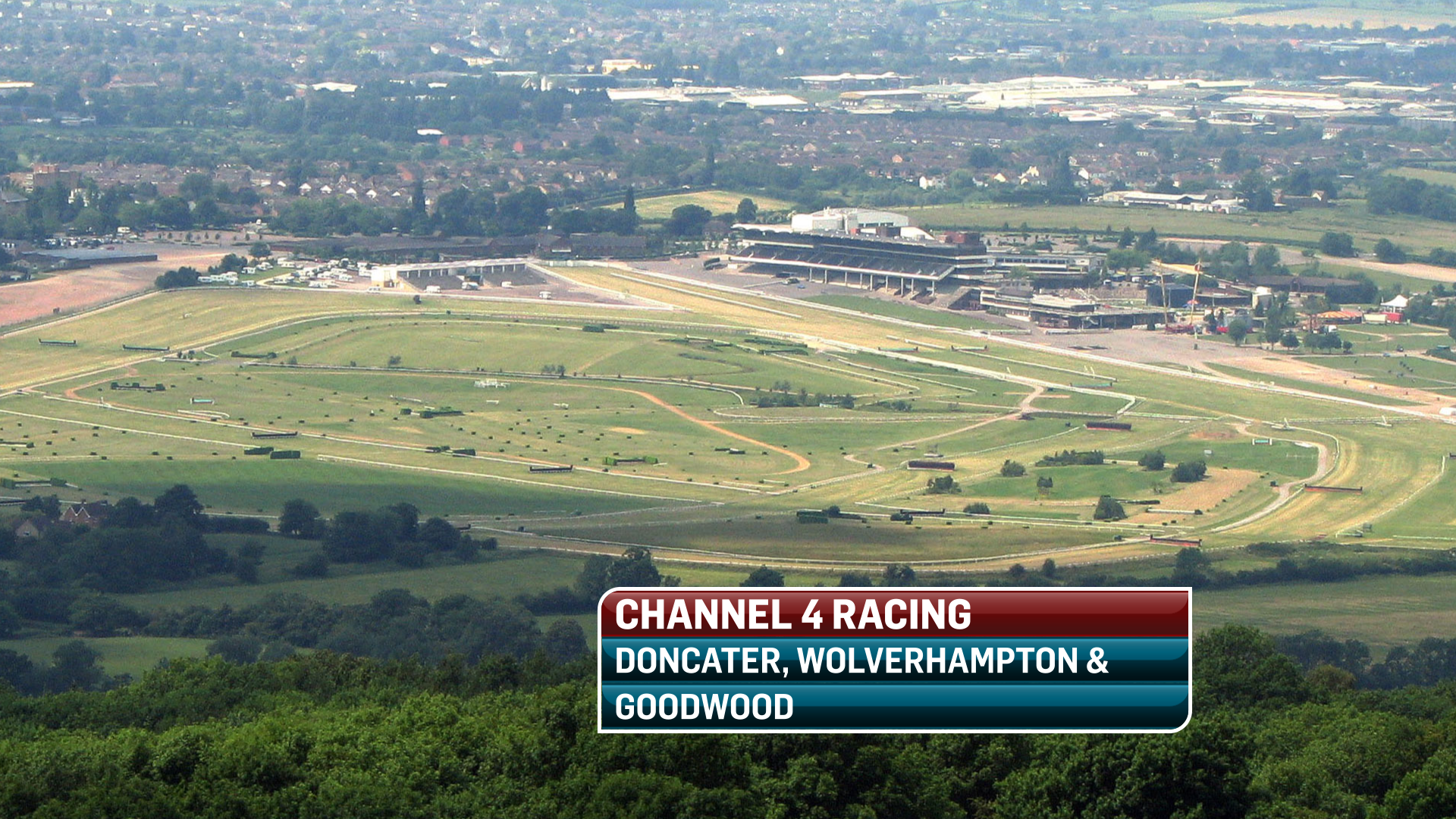
Channel 4 Racing embraced a new look in time for the Cheltenham Festival back in March of this year. The restyling coincided with the recently renewed 3-year media rights agreement and Channel 4’s strategy to deliver horse racing to increasing audiences.
David Phelan of Mode Vision was approached back in August 2009 to pitch ideas and visuals for a new on-screen brand. Having delivered a successful pitch, Mode Vision was charged with the task of designing a new look which would become synonymous with Channel 4 Racing. The brief was to create a style and palette which can be easily adopted across all relevant media (e.g. titles, stings, replay wIpes, set design elements, editing etc.), and to exploit the new chosen 3D CG (character generator) to it's potential, developing a dynamic and compelling new look to this energetic sports broadcast.
Highflyer Productions, who produce the racing for Channel 4, recognized the need to embrace change. This junction saw their graphics workflow transformed from a 2D platform (Aston Reds) into the new world of 3D real-time sports graphics. All new live on-screen graphics were to be considered and built on the VizRT – a state of the art live 3D graphics system. This new CG although it gives the operator somewhat less flexibility to generate last minute free form graphics, it does allow for much more complex & creative 3D scenes to be built and played out in real time. This opened up a new world of possibilities and challenges for the designer.
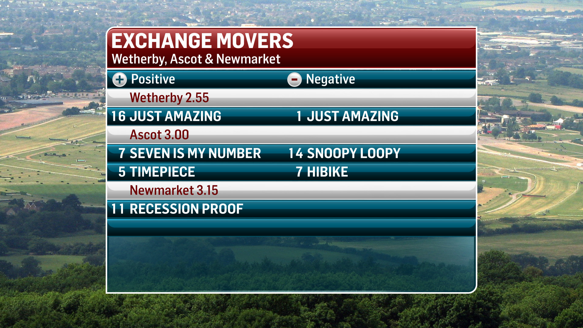
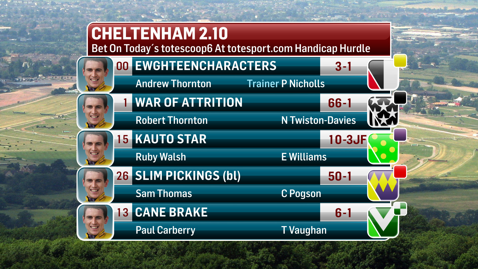
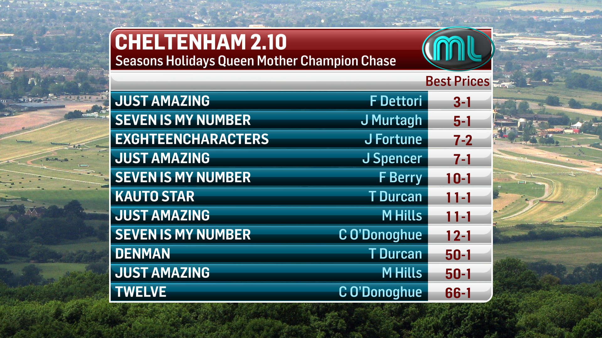
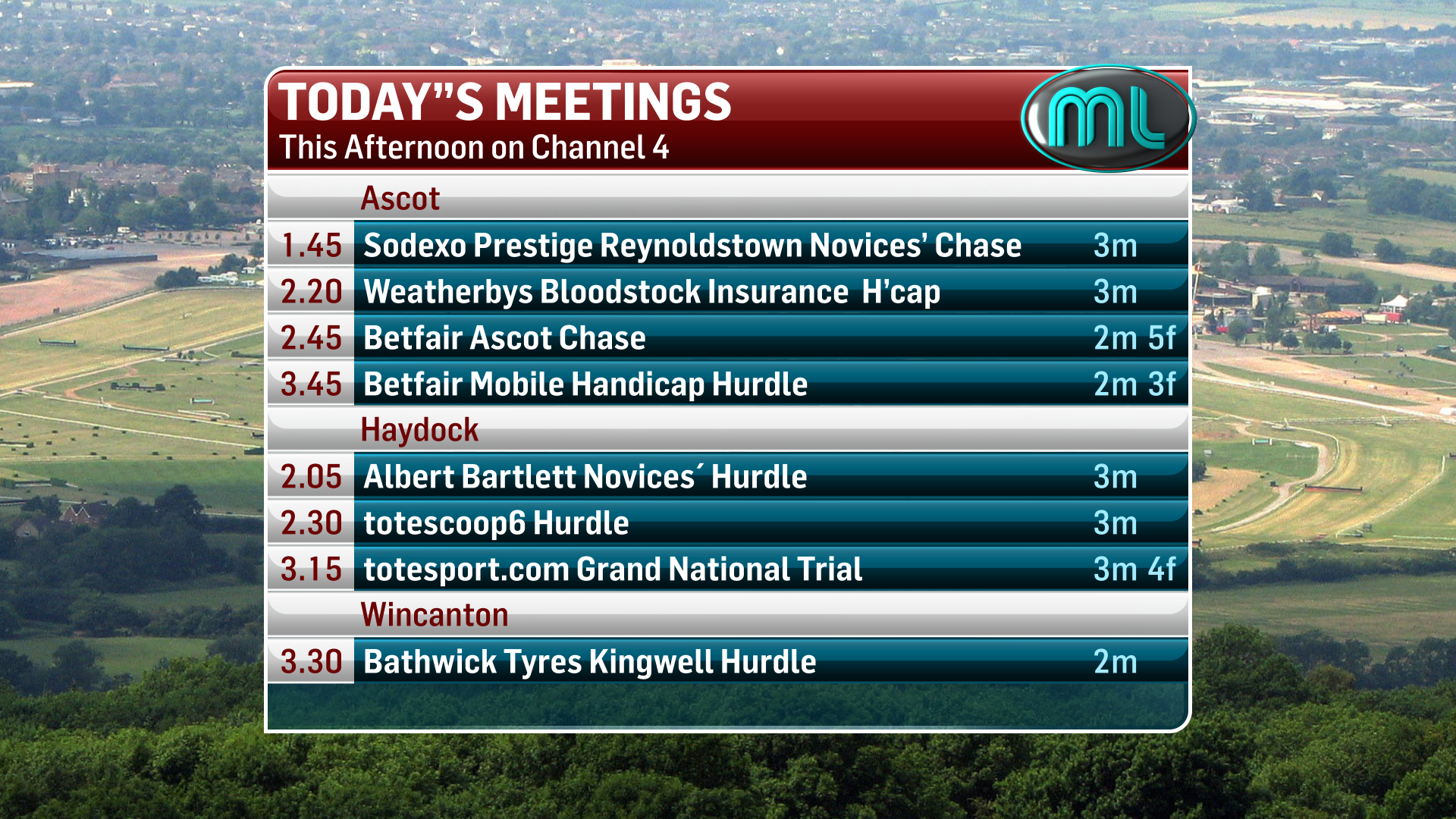
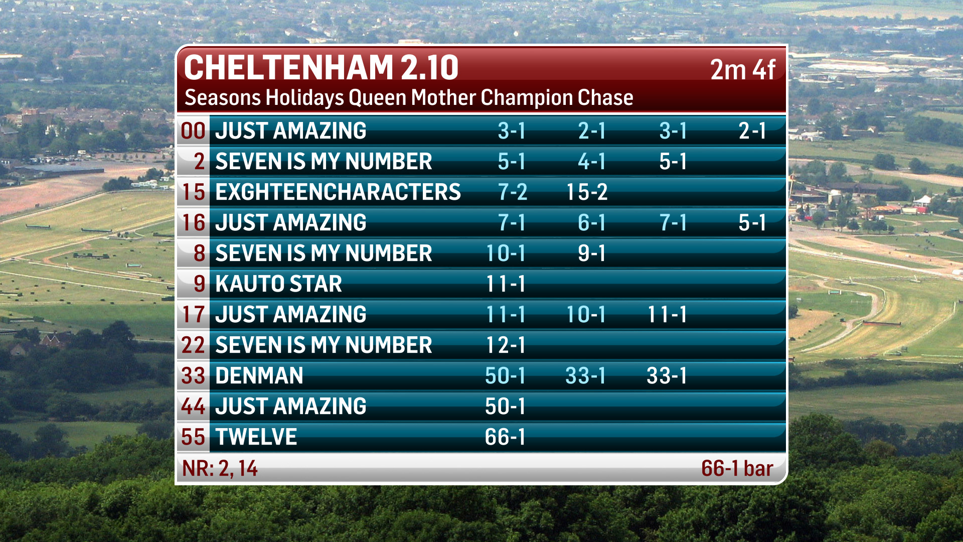
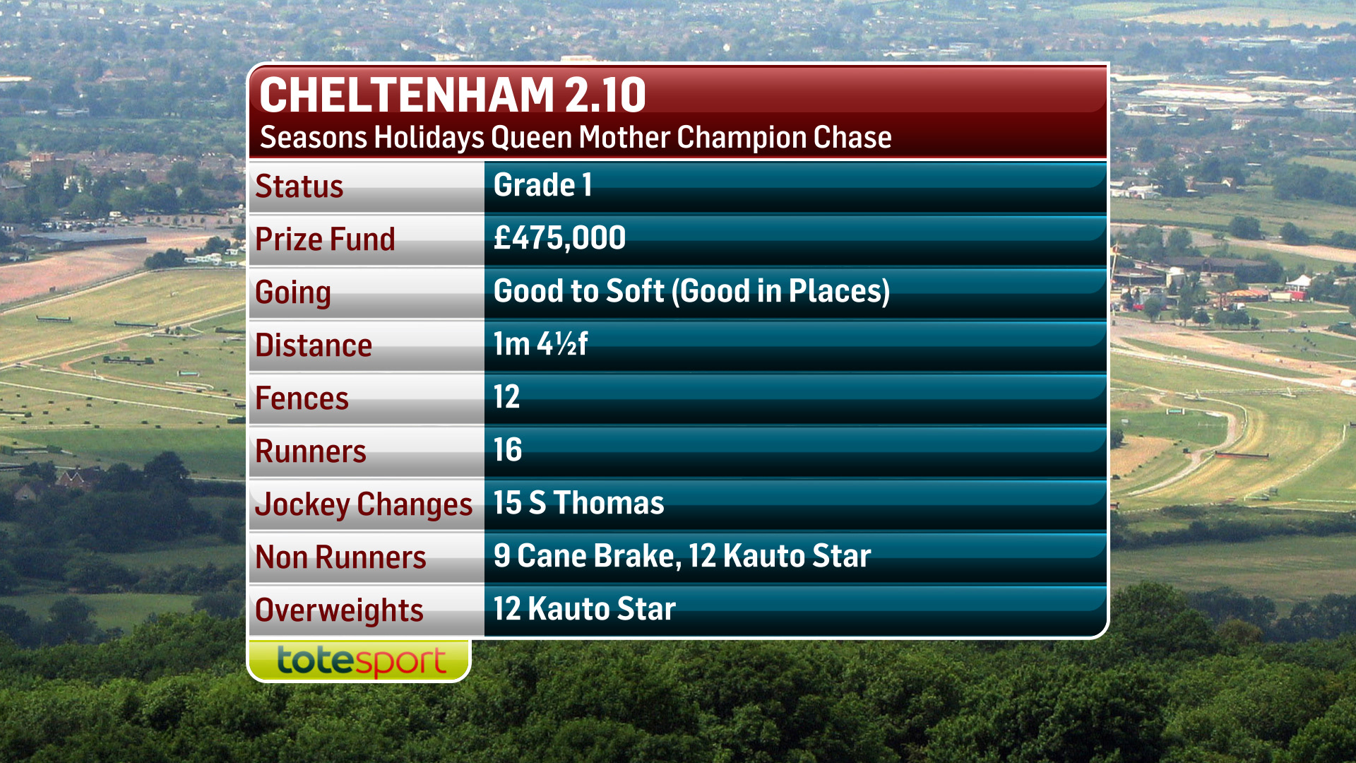
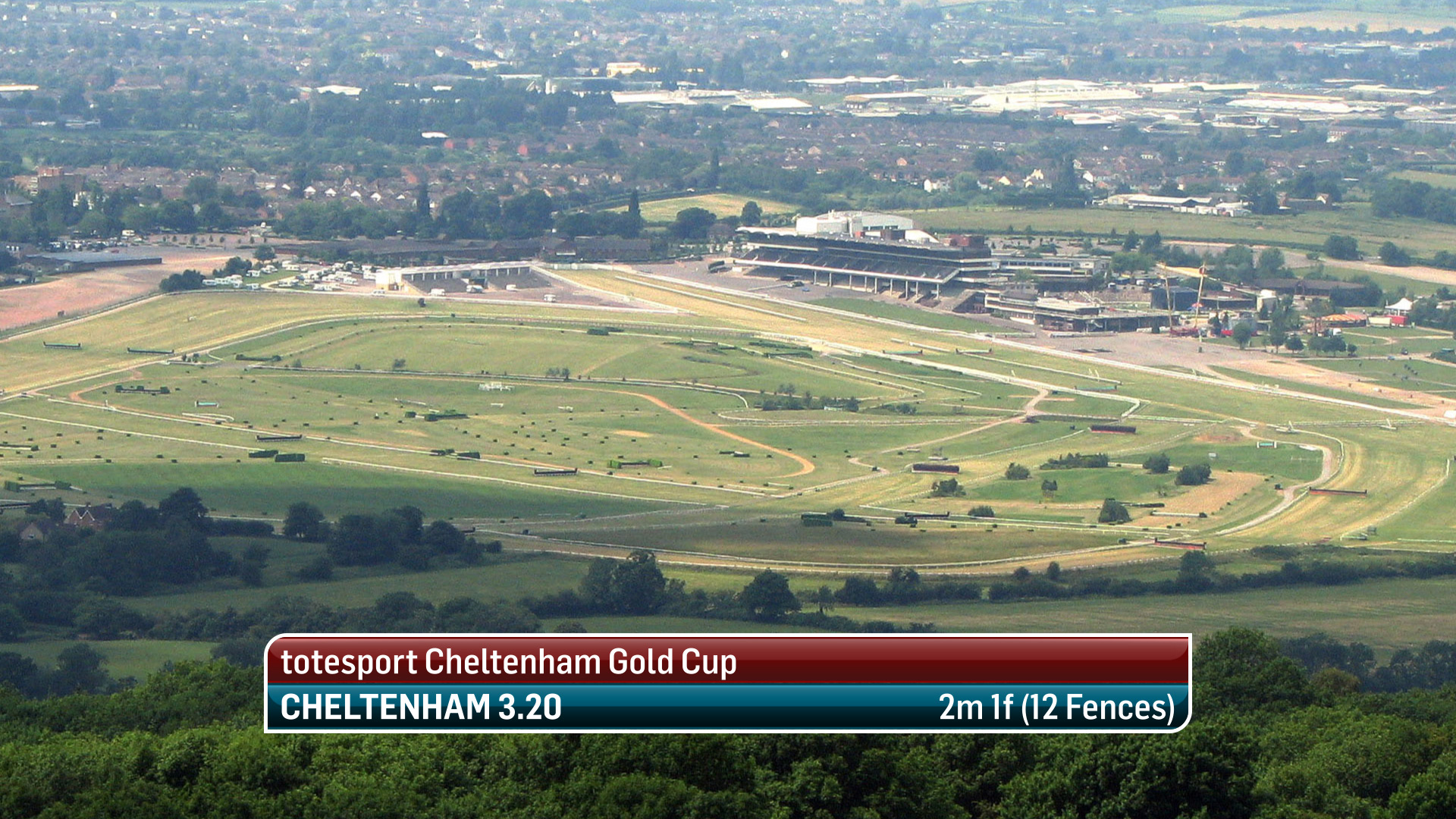
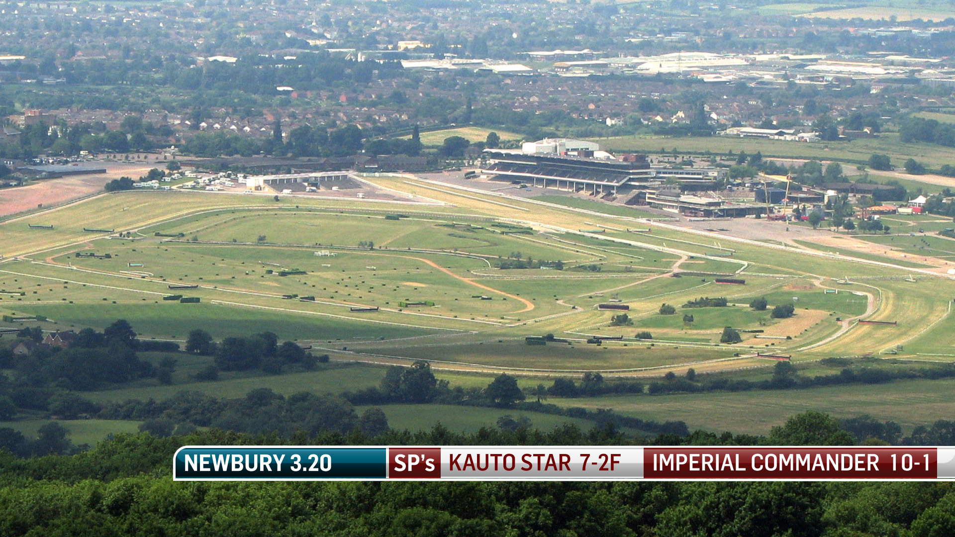
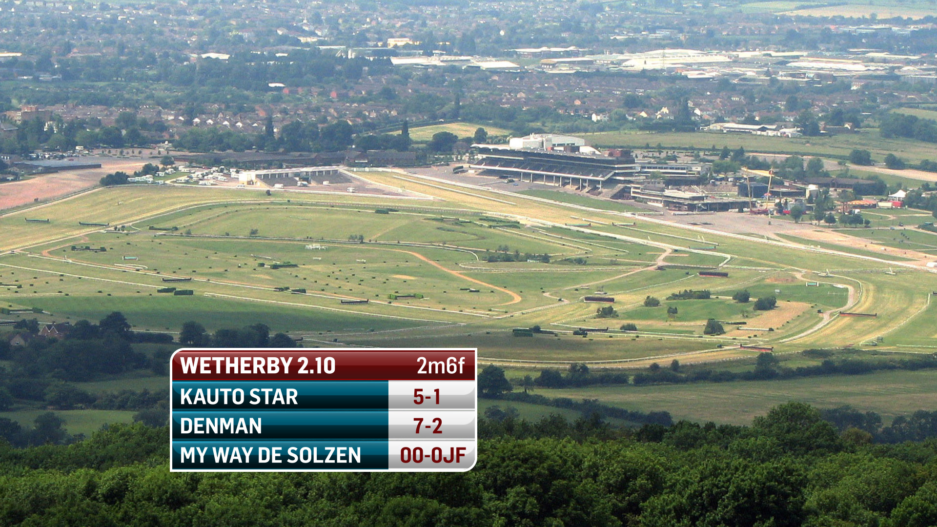
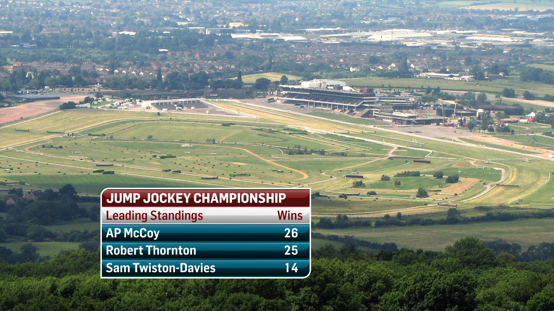
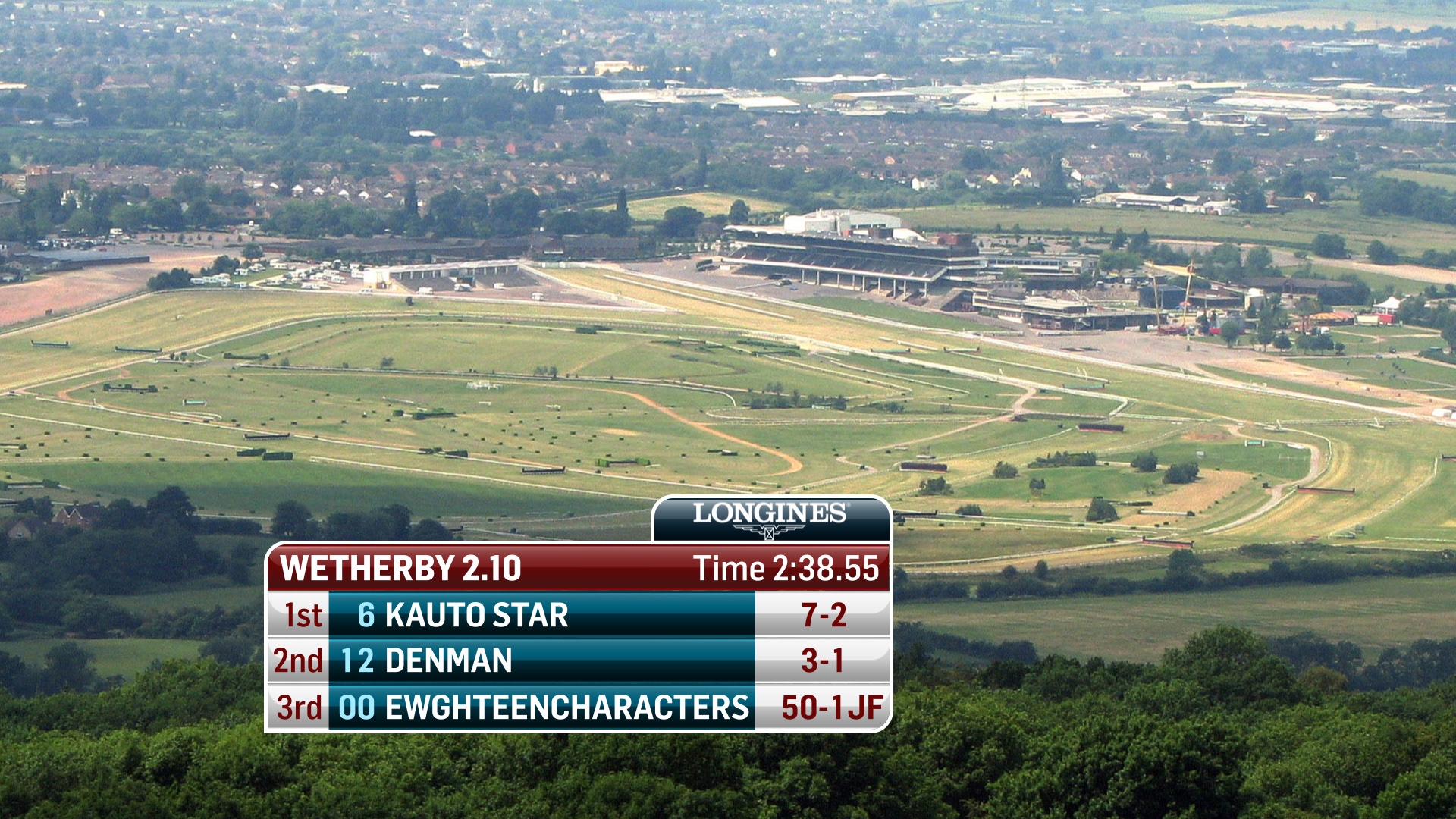
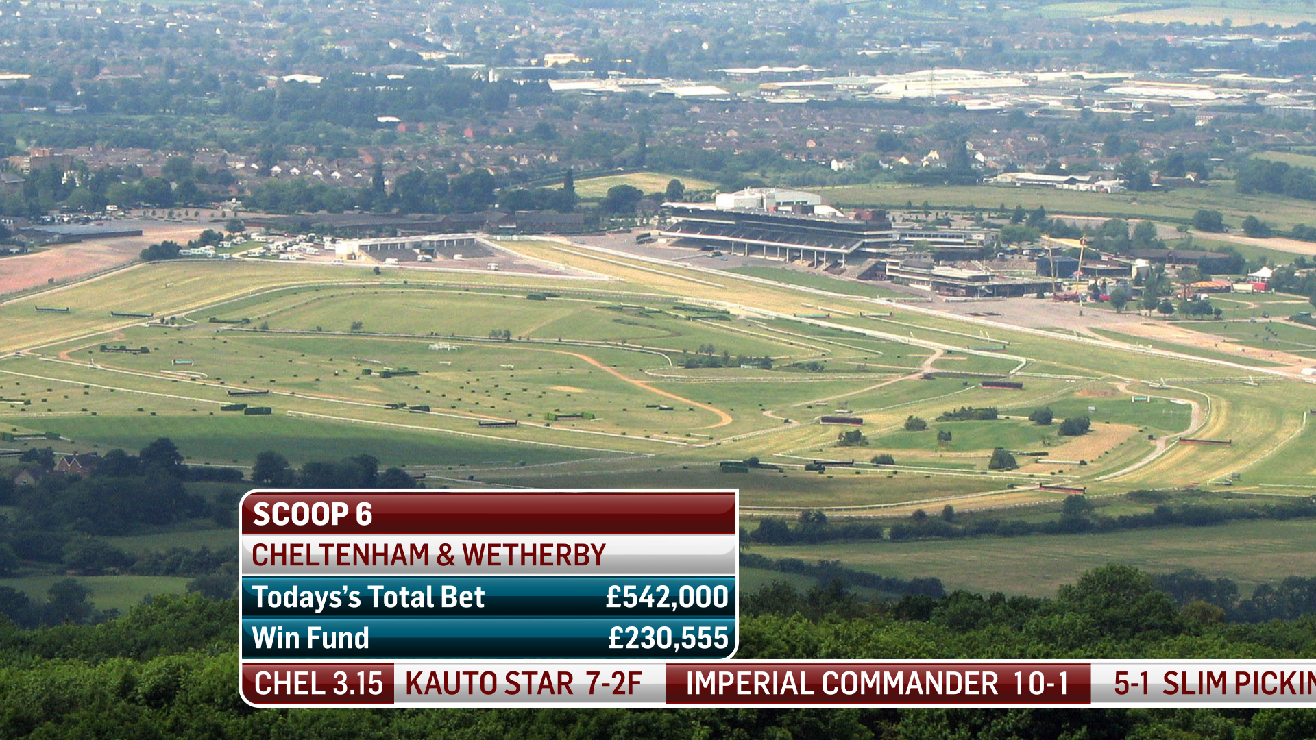
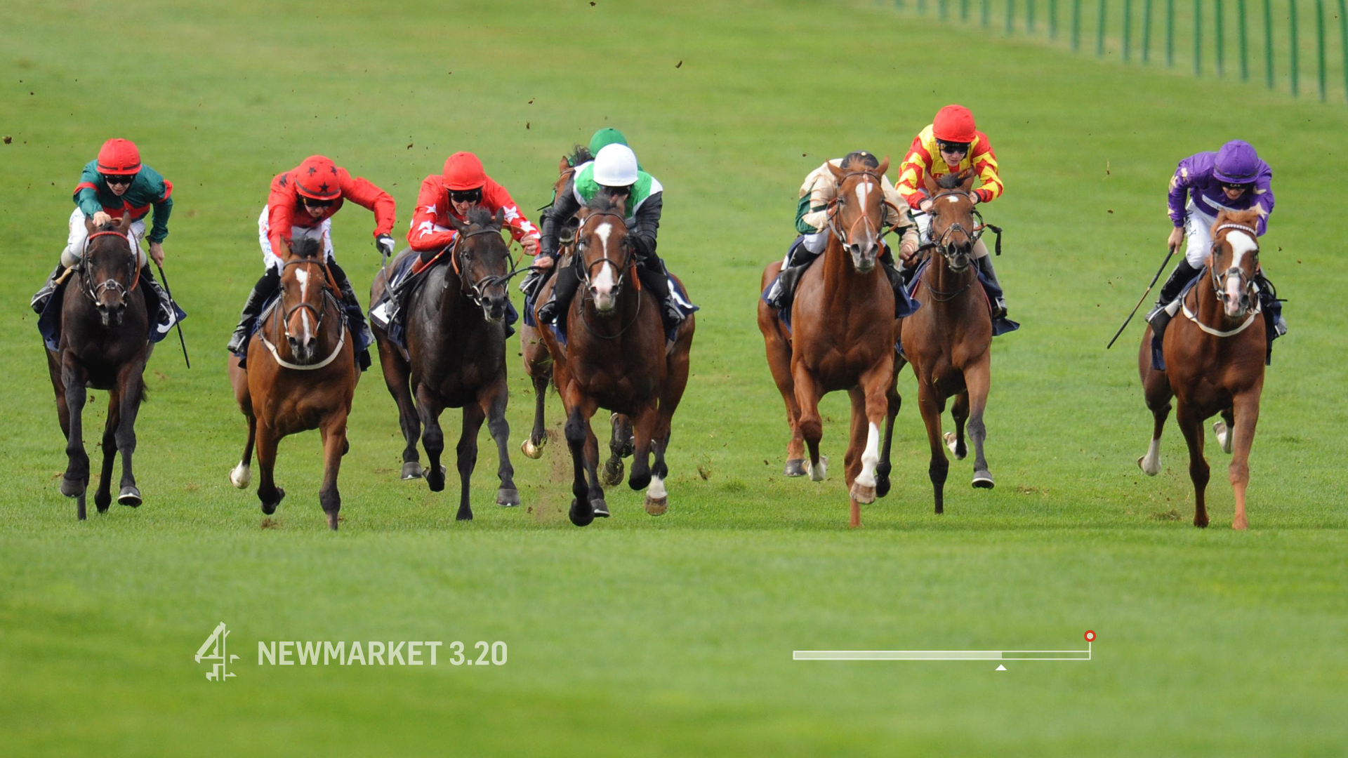
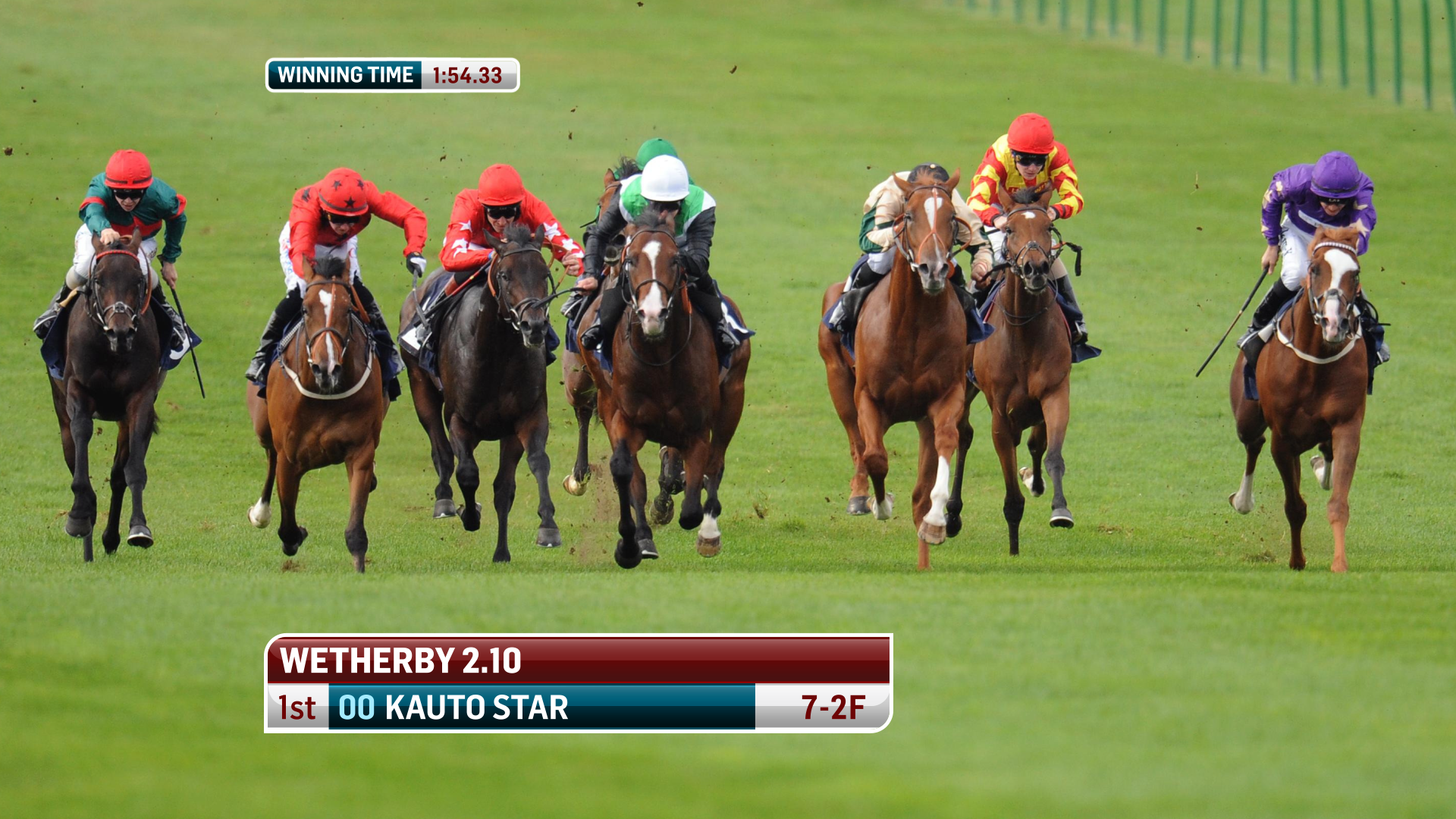
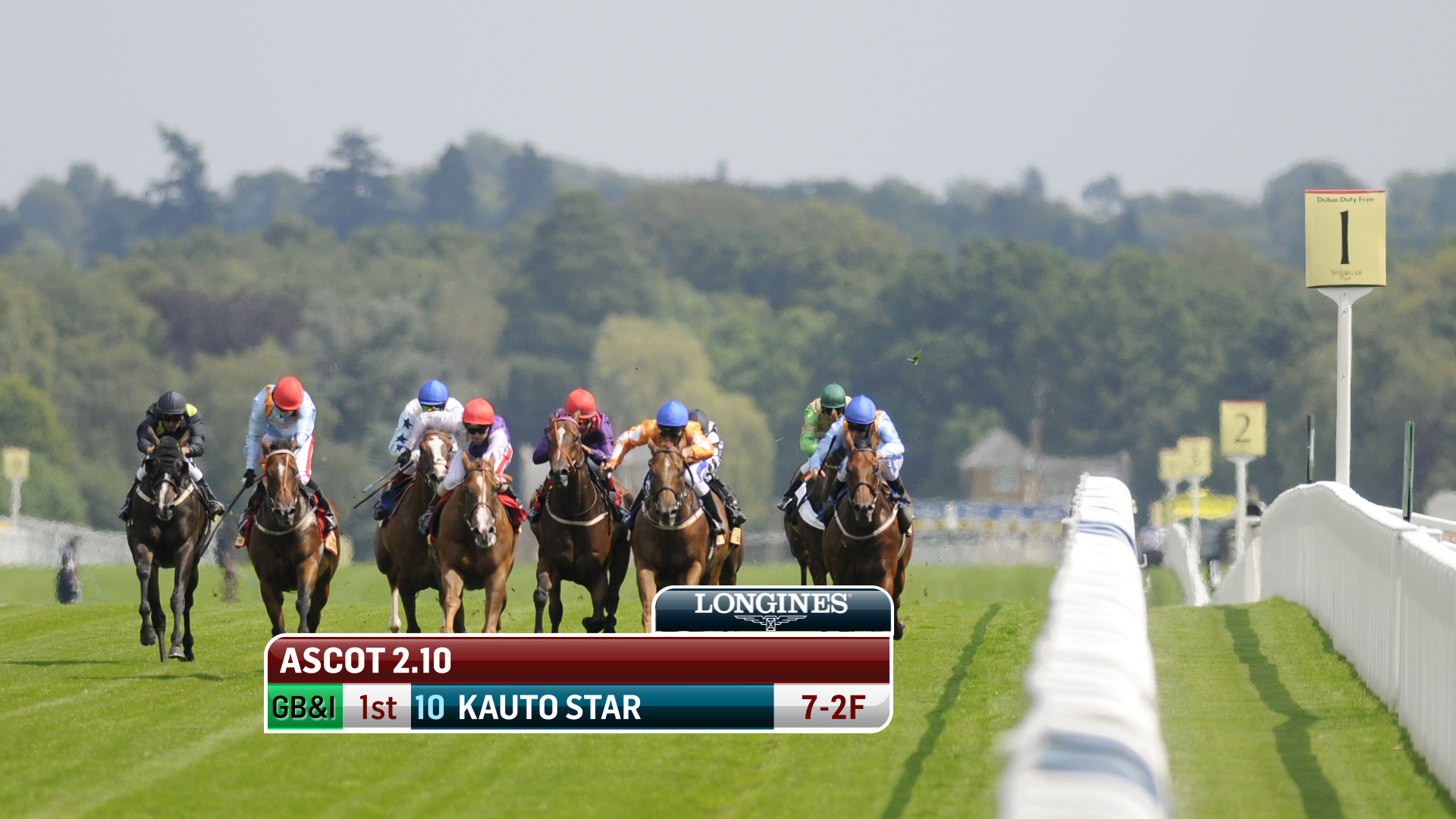
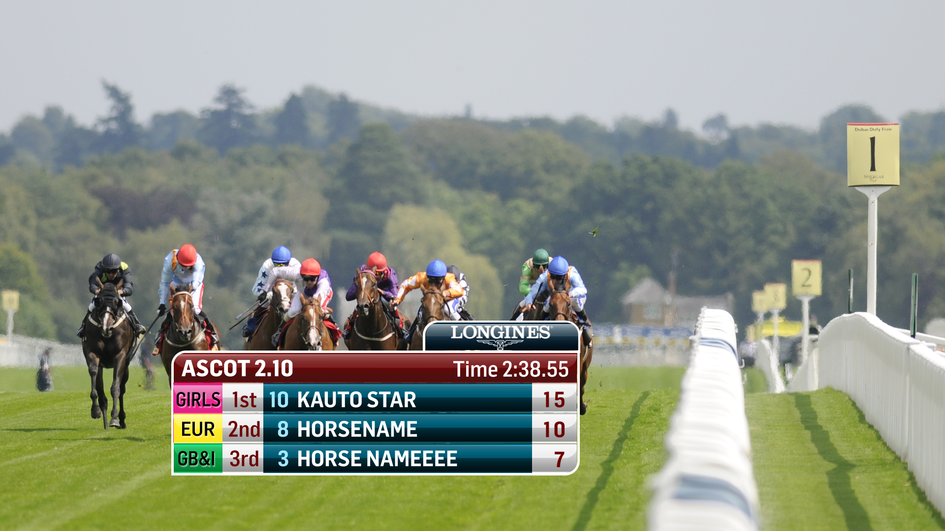
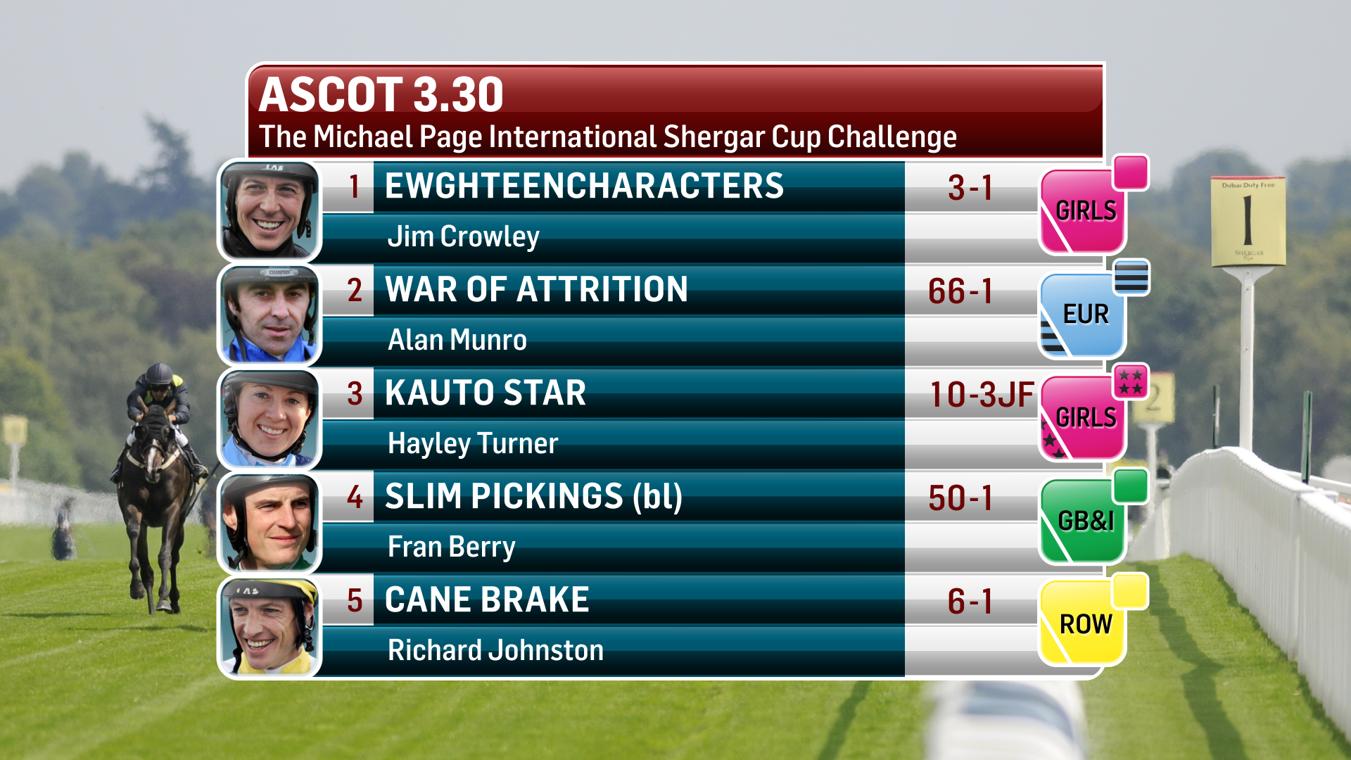
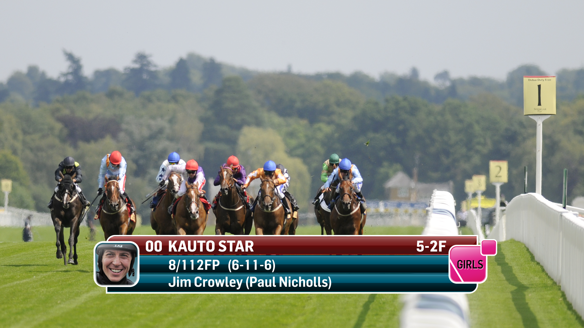
Capturing the viewers imagination and attention is paramount. The requirement was to creating attractive, legible content which displays all relevant information to the viewer in a manner which is both inviting and informative. A multitude of graphic pages and pre-templated layouts to cover all scenarios had to be designed. Horse racing coverage is probably the most graphic intensive of all sports on our screens. WIth an average 6 races during each transmission the amount of betting information, runners and riders details, formcards and other statistical racing information that needs to be catered for can be quite substantial.
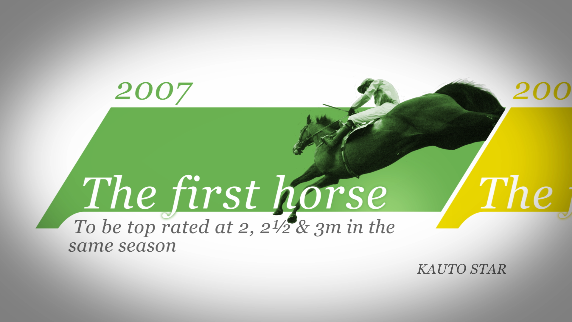
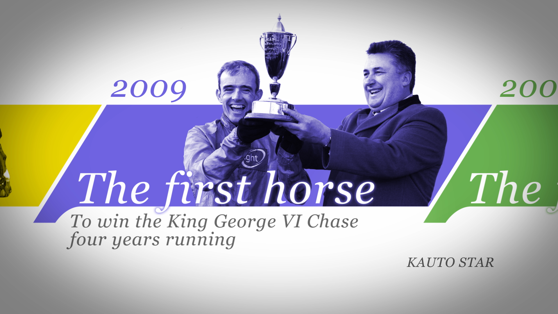
The approach undertaken was to combine fashionable colour and shapes with an innovative 3d approach. A new colour palette of cyan, rust and white was chosen with 3 complimentary text colours. These are used in a variety of combinations to suit the diverse range of graphic layouts giving emphasis and prominence to specific information. The movement and text reveals were all given added subtleties and purpose within the new 3D environment.
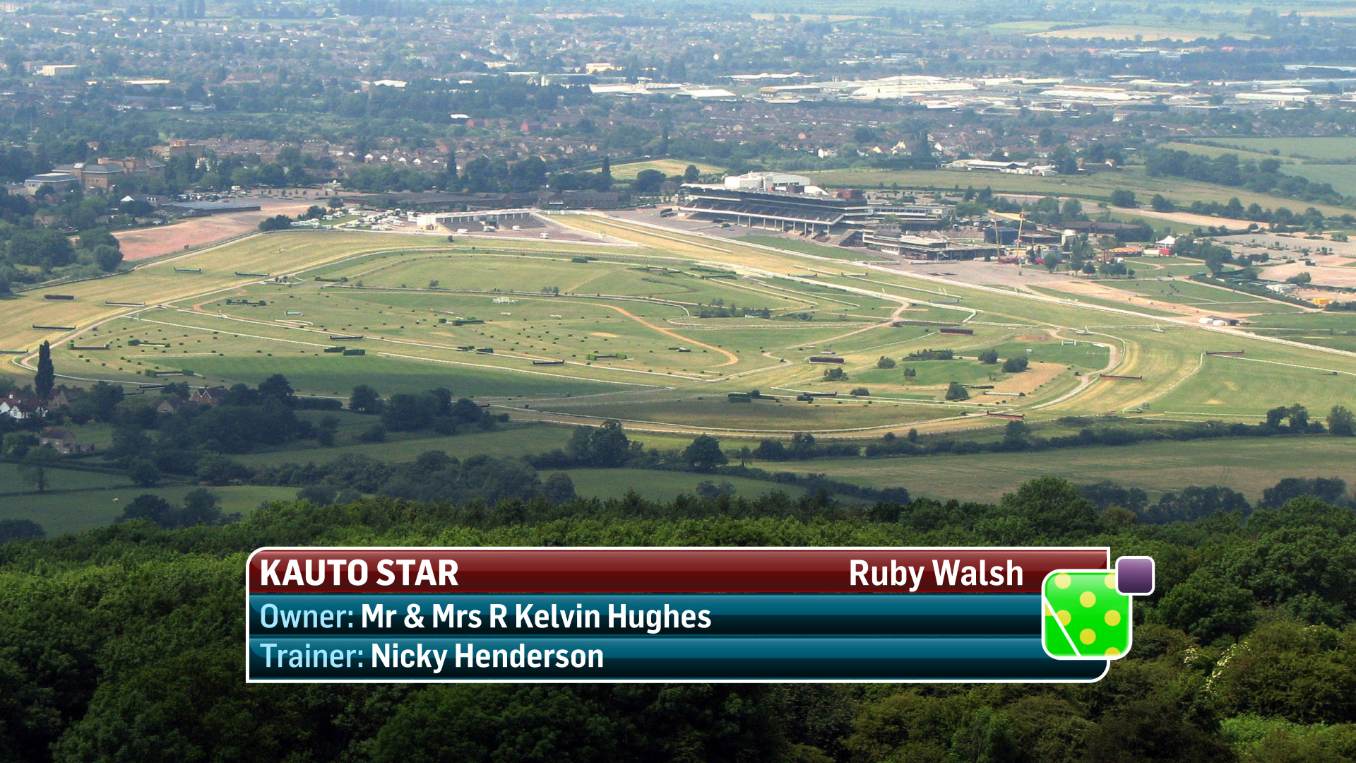
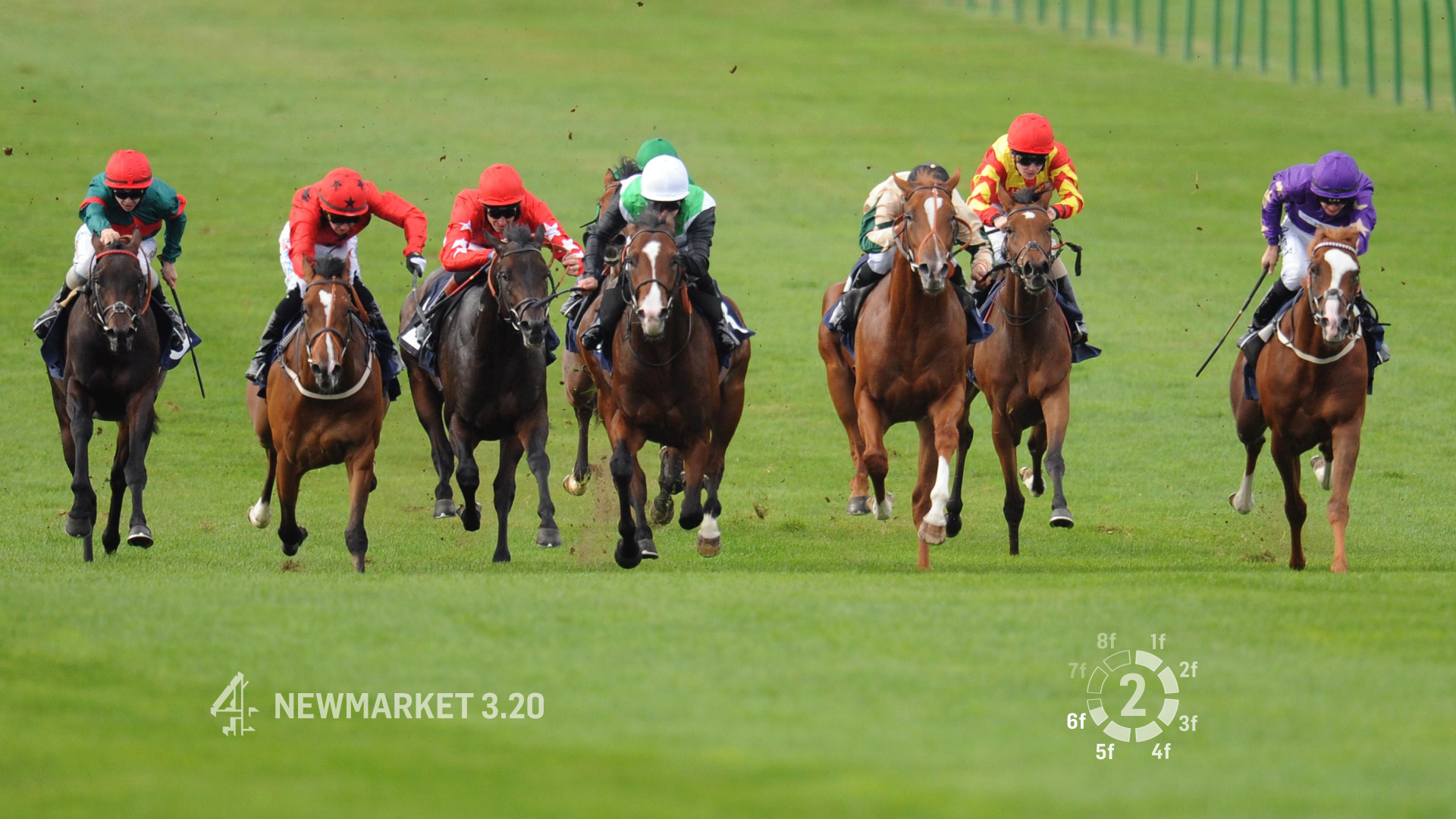
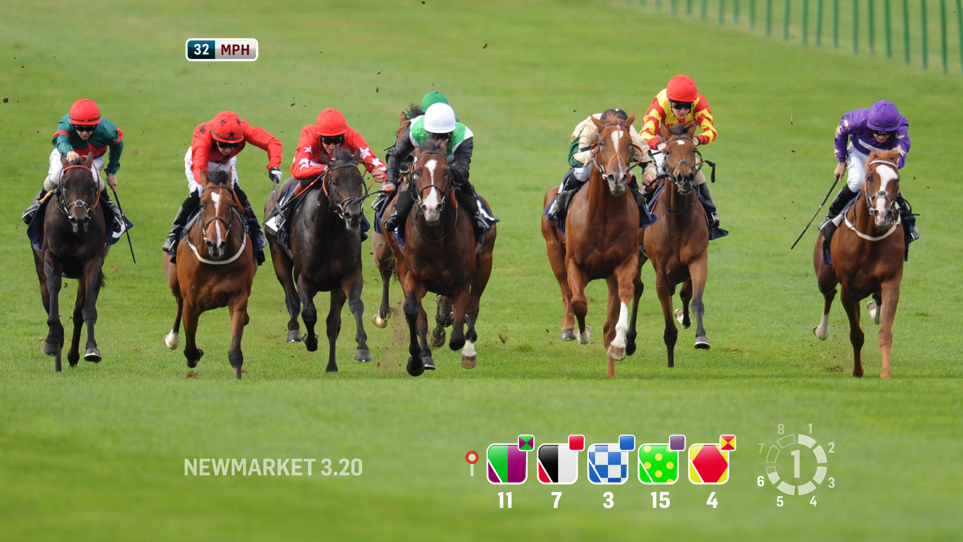
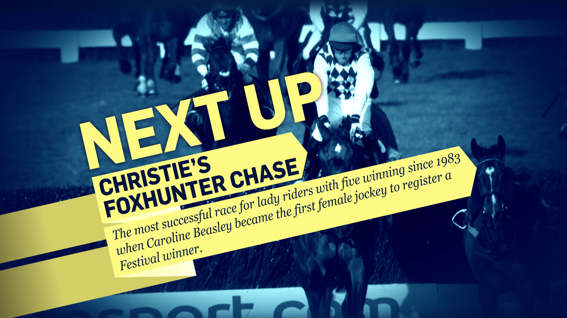
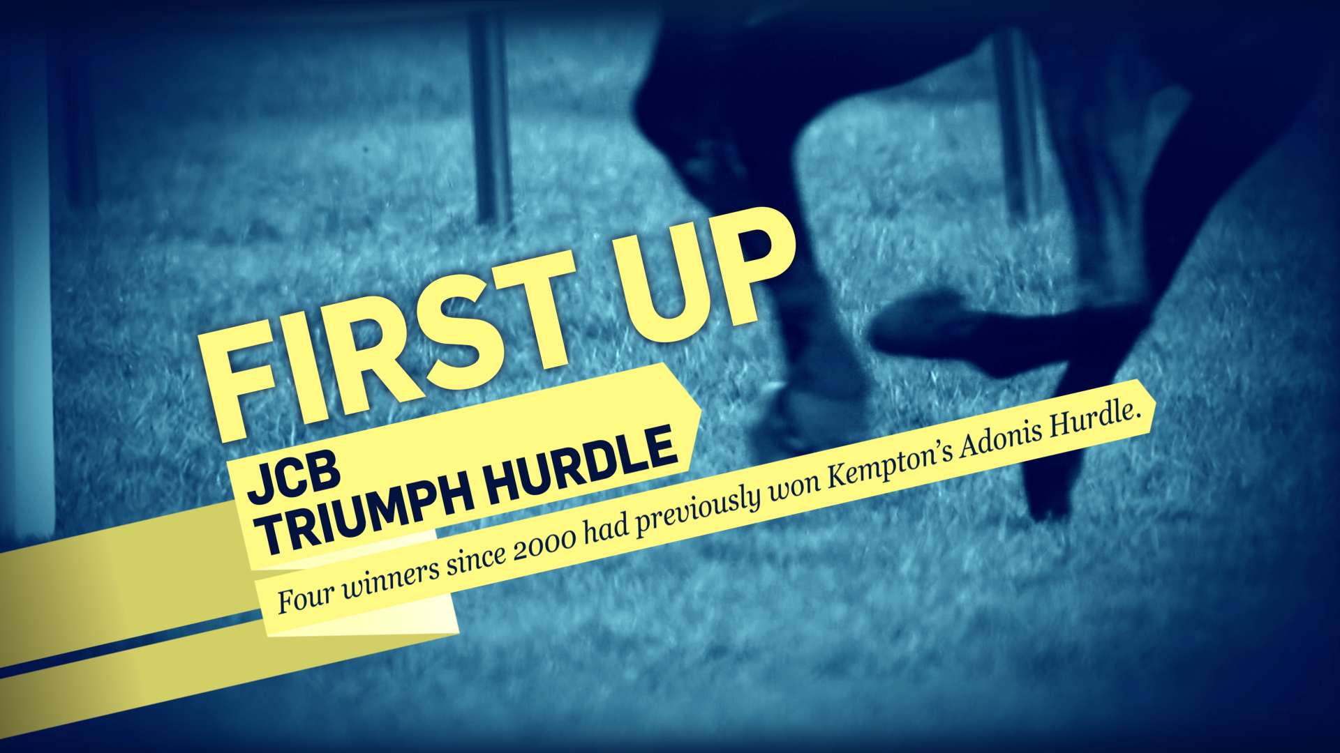
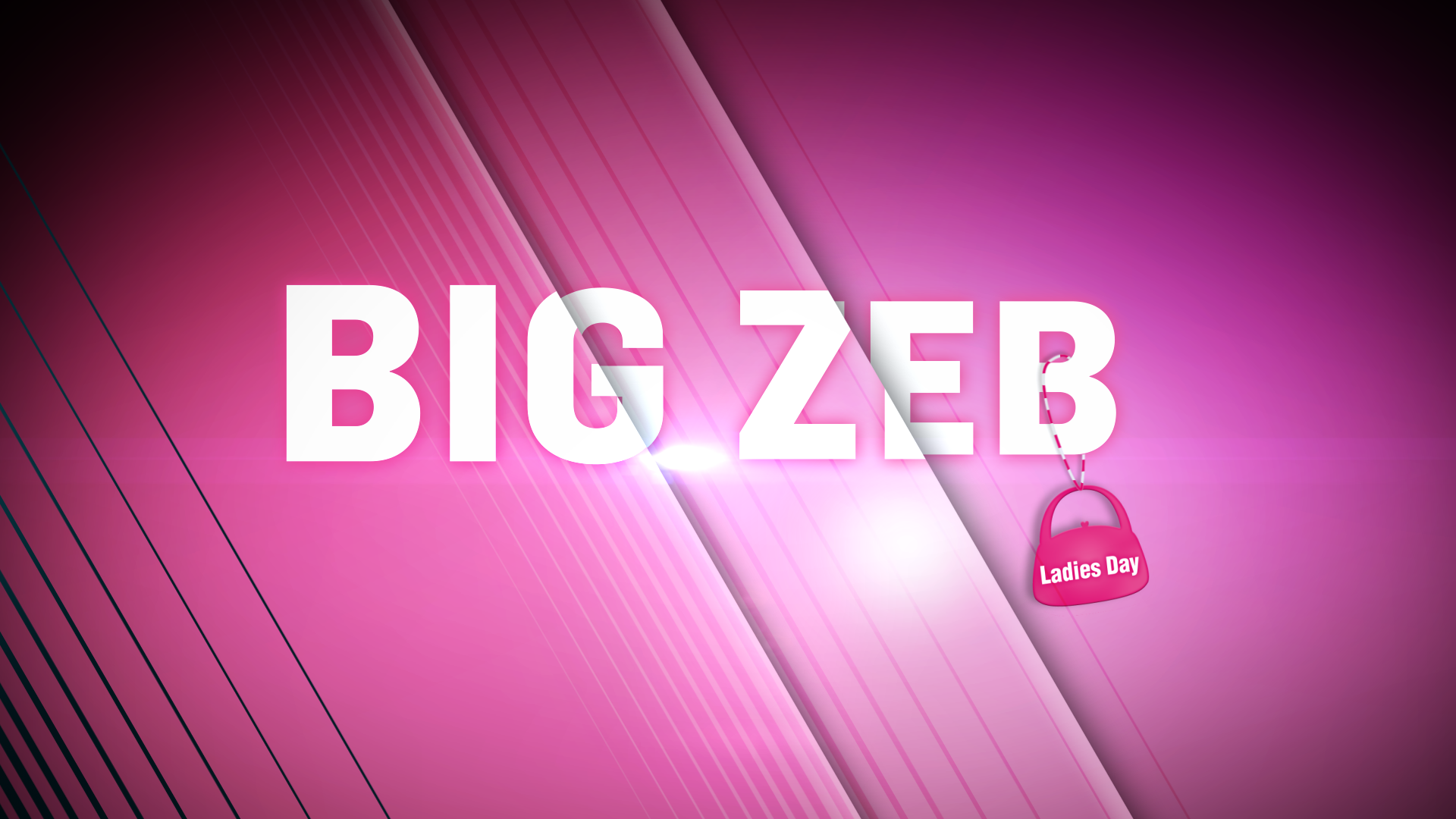
The animation is an integral part of the build. Transitions between different layouts and quick load times all need to be considered. A modular approach with a panel based set up was designed to facilitate the required functionality. Long standing graphics templates were updated and the real-estate on-screen is used more effectively to flatter live shots. Recycling text within given areas of the screen in an effort to compliment the live action shots rather than obscure the viewers enjoyment. An enhanced application of the ‘Silks’, through a new styled suggestive approach was also derived, moving forward from the traditional jockey colours in an effort to make it easier for the viewer to spot their favourite horse. New menu scenes and runners and riders montages were also created from the new shapes and forms, a thoroughfare of rotating panels animating in and out of view revealing ingested or live VT shots and displaying software driven data relevant to the visuals.
This new dynamic approach is also complimented by various sound effects which further enhance the movement and subtleties of the new brand. Each page animation has an accompanying sound effect, create by Ivan Fitzpatrick Music, which adds an extra flavor to the graphic scenes, giving punctuation where needed and a hint of movement.
The chosen font ‘Flama Semi Condensed’ has a wide range of weights. This is important as it supports a multitude of layouts giving emphasis to specific information. As legibility is paramount, this semi-condensed family manifests itself in a clean and accurate manner. With its neutral flavour, ‘Flama’ proves to be highly efficient for displaying an abundance of information in limited spaces while still maintaining it’s clarity. ‘Flama’ is also a well-kerned font, with letter spacing which is proportional and specific to individual kerning pairs.
Denise Large, Channel Four Racing’s director and project leader, explains: “Our innovative graphics were created by David Phelan – Mode Vision - a top sport’s graphic artist, and I’m really delighted as they will give a modern 3D feel to our programme. The work has wonderful energy and that is just what racing is all about.”